Within the first week of March, students, faculty and staff opened their browsers to find something out of the ordinary.
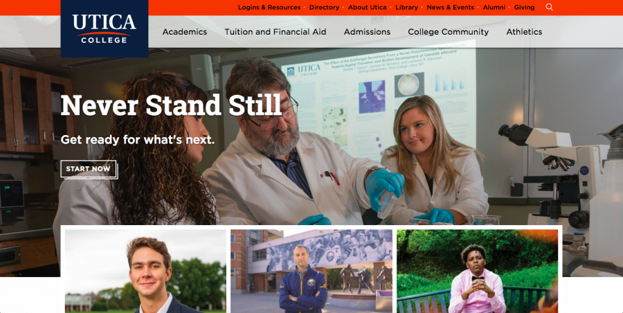
Utica College’s new website, which has been in its planning stages for months, had launched.
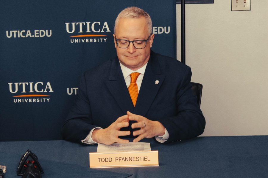
One of the brains behind the new website was Kelly Adams, UC’s assistant vice president for advancement/marketing communications. On Feb. 28, Adams sent an email to the entire UC community letting them know about the launch of the website. In the email, he acknowledged the fact that the transition to the new website will require a period of adjustment, as frequent site visitors will have to become acquainted with the new design and navigation structure.
“Your input has been crucial throughout the course of this project and we look forward to your feedback as you explore the new utica.edu,” Adams said in the email. “The web team will be working on improving, updating and adjusting the site over the coming days and weeks, so your continued cooperation is much appreciated.”
Adams said the new website has a cleaner design and a simplified navigation structure.
“I believe the biggest difference between the new site and the previous version is the addition of more dynamic content, which allows for greater storytelling,” Adams said. “On the technological end of things, the new site is built on a new content management system (CMS).”
Adams also acknowledged the fact that the planning process was an inclusive effort that involved people from many different constituent groups. The steering committee had broad goals for the new website, while Adams and the other members of his team did not have a preconceived notion or vision of what the website was going to be.
Adams said that the vision was born out of feedback gathered from current and prospective students, faculty, staff, alumni and users.
“Websites are, in essence, living, breathing things, and they are never ‘finished,’” Adams said. “Rather, they constantly evolve and change in order to meet their goals and objectives and keep up with the demands of users, technologies and trends. In the immediate term, our focus is really on creating dynamic, new content.”
Junior Brittany Smith did not hear about the new website until a couple weeks before it launched. After seeing the new website for the first time, she said that it looks much more organized than the old one. Smith said that the video clips on the old website were distracting.
Smith also praised the fact that there are stories just for prospective students. On the other side of that, she said that the website’s background is “a little bit too white.”
“I also like how you can compare different majors,” Smith said. “The directory is so much better, too.”
Senior Kristen Przybylo said that the first thing that stood out to her about the new website was that it had an appealing layout and format. She also said that she likes how faculty and staff members have updated photos of themselves on the website.
“It was definitely appealing to the eye and it was nice and bright as if it were going to catch your attention,” Przybylo said. “I like how it isn’t dark, and how it also has some updated pictures of students and faculty.”
Aside from the praise, Przybylo said that there could be some improvements that could be made. One in particular, is the fact that the new website involves more clicking. She used the student login page as an example.
“You have to click on the top of the page for logins, click undergraduate, or whatever category suits you best, and then comes to another page that has you click on the only button that says ‘Logins,’” Przybylo said. “I think that last page isn’t necessary and it gets slightly annoying when you are constantly visiting that page to get to a certain login.”
Przybylo said that she now finds herself googling the web link rather than navigating through the website.
“I don’t think I would change anything else about it, except for the numerous pages you have to go through to get where you have to go,” Przybylo said. “I think the ‘hate’ about the new website is because it’s new and it just needs to be figured out again.”
Senior Lara McNamara did not know that UC was redoing the website but was pleasantly shocked to see the update.
McNamara said that if she was in charge of the website, she would not change anything about it.
“I personally like how clean and easy the new website is to operate,” McNamara said. “As a whole, I think that updating our website from time to time allows people to see that we really never do ‘stand still.’”


